Saturday 9 May 2009

Overall.

  • I have got a full understanding of Photoshop
  • Creating a Blog
  • Organising and sticking to tasks.
I felt that this project was a much easier project to put together as i had to choose all my ideas myself for my target audience instead of having 5 people in a group and putting every ones ideas together to create a project for a target audience. Photoshop was not a new software for me when i was creating my school magazine cover but i felt i could not use my full knowledge as others had to join in and work together for one project. This project on the other hand was a much easier project as i could choose everything myself and have everything organised the way i wanted it. I have gained a great knowledge from using Photoshop to create my project.
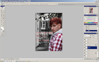
Overall i felt much happier creating my covers this time round as i could choose everything i wanted and have everything how i wanted it to look, if something had not gone right then i could adapt and change my original idea.

I am very happy with the outcome of my magazine as i feel it has met my target audiences standards. I have enjoyed creating my magazine covers and would like to embark on doing another project which is similar.
Technologies.

I used Adobe Photoshop Pro CS2 to create my magazine covers with.
I learnt how to experiment with new tools and learnt how to create a high quality image using the most simple tools. After completing my covers my skill level has improved dramatically.

Advantages of Photoshop over Publisher and Fireworks.

Photoshop -
Adapt and change different layers, clone tool, spot healing brush, free transformation, very simple, variety of tools to change, cut, crop and define an image.

Publisher -
No zooming preferences, auto levels, simple and easy to use, not many tools to make a good quality cover with.

Fireworks -
Difficult to use, very challenging software, requires a good knowledge, no zooming preferences again.

I decided to use Photoshop over Fireworks and Publisher as i have had previous knowledge of the software from when i created my school magazine cover. I used Photoshop to remove any spots or misfits on the face, to crop and re size any images and also to edit my fonts for my covers.

Equipment used.

I used a Sony A200 DSLR digital camera to take my photo's with, this camera was a very good choice as i could get good clear photo's with it. I could use a lot of zooming options as well as changing the lighting and contrast. None of the images i had taken were blurred in anyway.

Tools;

Brush Tool -
Very simple to use, effective, easy to use in small and large areas. Often blurs around the line when you draw a line.

Clone Tool -
Can be hard to use at times, simple to use when you want an area cloned to another area. Requires you to hold ALT to select an area to clone. Can be hard to use in really small area's.

Free Transform -
Very simple to use, either use keyboard shortcut (CTRL +T) or go to edit and free transform. Re size images and rotate. Focus' into image when you've finished editing.

Text - Simple box can be made to type into, very easy to use, change font size and change colour. Same as on any other software.

Cropping Tool - Anything unwanted can be discarded of, simple to use, select area wanted cropping, right click and crop. Does not lose any of the images quality.

Paint Bucket Tool - Same as on any other software, click paint bucket and select colour, apply on area needed to be coloured. Also you can use the gradient tool which lets you choose a gradient changing to different colours, simple to use.

De-Saturation Tool - Simple to use, click de-saturate, and apply on area that you want saturated. Effective if you want a black and white background.
Audience.

Owen is a 19 year old male studying graphics, biology and media in his second year at sixth form. He has been very successful with his results in his first year and is wiling to work just as hard to get good grades in his second year. He is a very outgoing individual who loves to party, socialise and play sport in his spare time. He is into a range of different music such as Grime, Dubstep, Hip hop, Baltimore, Drum and Bass and Ghetto Tech. He tries to find as much time as he can to go to gigs that include artists from these genres. Owen has two genres of music that he listens to most and these are, Hip Hop and Grime, on the odd occasion he will listen to Dubstep and Baltimore. Also in his spare time he does a little but of DJ’ing to show his interest in music. He loves to DJ at his mates party’s where he can show off his unique style of music so that others can appreciate and enjoy his type of music.

Target Audience Appeal;

  • Target Audience 17-24
  • Urban mise-en-scene, Attracts target audience
  • Powerful, striking images to draw attention
  • Type face - appealing, interesting, simple but effective
  • Broken conventions to fit in with the house style, makes magazine more memorable and not forgotten
  • Attractive layout, easy to read
  • Pages are neat and do not have too much going on
  • Images catch your eye and bring you to reading the magazine.
I attracted/addressed my audience by looking at magazines that displayed media about the urban scene, i then looked at all the articles and pages and decided that the urban scene appeals more to younger students aged around 17-24. This shows that the majority of students are either in college/sixth form or are at university. I then decided to ask a majority of young people what they thought of the underground urban scene and carried out a number of questions to ask them about their opinions.

Friday 8 May 2009

Distribution
If my magazine was to be distributed it should be distributed at the beginning of every month as it would give time to collect all the information and data to make the magazine fun and appealing to the target audience.
Features include;
  • Fashion
  • Articles
  • Competitions
  • Featured artists
  • Upcoming bands

My magazine would be sold in supermarkets, newsagents, on the Internet, music stores and adverts which are shown in my magazine.

Commercial Funding;

Benefits - Adverts and brings sales.

Drawbacks - Fee's for being at the place.

Target Audience

Magazine will cost £3:20 in England and Ireland, overseas price seen inside magazine.

Has to be the right target audience as we need sales to go up every year for funding of the magazine and extras which will be included. Young target audience would show the most interest in this magazine.

Representation.
Front cover:
I have chosen this main image because he relates to my target audience. This is shown by the way he is dressed which is in an urban style. His age is important as he must attract other readers into viewing this magazine. Also this is aimed at a certain age group which i am trying to appeal to. The gender is mainly male as there are not many females who find this kind of music appealing. I feel that this style of music genre is beginning to become more and more popular so there are more and more people who will find it appealing and want to read the magazine. I think that this magazine could not be made anymore attractive to the target audience than it already is.
Contents:
The images i have used on this cover are very appealing and relate to the image on the front cover as you can clearly see that i am portraying an urban scene. You can see clearly from the four images that they are staged staged photo shoots. All of the subjects in the images are wearing urban clothing showing that it is still representing the urban scene. The colour scheme i have used is relevant to the urban scene and target audience as they usually like to see dark pages with graffiti font styles. I decided to use black, grey and white as they are all neutral colours and look appealing together. The age of the occupant in the image is at the lowest end of my target audience age which is 17. I felt i had to use an image of a young person as it would draw young readers into reading my magazine. I decided to use male subjects throughout my magazine as i felt this would be the best and easiest way to get hold of peoples attention.
Double Page Spread:
I have used a simple image that i took in town for this page as it is natural and very appealing. i decided i wanted to use this image because the subject is on one side and there is a wall on the other side that i could base my writing upon. The mise-en-scene of the image shows a clear urban look and would appeal to a viewer to read the article. I have used Benedict in this image as he is slightly older than the subject on the contents page (Robert Troth). He is to be represented to the target audience as a producer at a young age.
Evaluation.
Forms and Conventions


Front Cover.

  • Masthead is very attractive and appealing. Black and white contrast each other, stand out more. On an angle which breaks convention, white out glow makes it easier to read. I decided to put at an angle because it makes it more interesting. Makes people look at it in a different way. Graffiti font style used to make it more urban looking, also to attract target audience. Attracts attention.
  • Main image is very appealing and attractive, edited to make main subject stand out, background de-saturated. Urban scene in background, makes image more appealing. Mid-shot with eye contact, makes you feel as if your in front of him. Very posed upfront picture. Draws attention to magazine. Kept the convention of having a main image that covers whole page.
  • Cover lines are short and snappy, quick and easy to read, simplified what is to be seen in the magazine. Font style again is graffiti, fits with magazine genre, seen on every page. Colour matches the colour of the subjects shirt, everything is kept simple but effective. Cover line headlines are kept short and snappy also. White to contrast black background. Text wrapped around main image to keep conventions.
  • Bar code is at bottom left to keep the conventions simple. Date and price are also allocated next to the bar code to keep the conventions also. Simple white writing to make it contrast to the black and white background of main image.
  • I decided not to have a banner as it would ruin the look and outcome of the magazine, another broken convention. Also i chose not to as i wanted the cover to looks simple and not have too much information on the front page. I also think that having a banner takes attention away from the cover lines which are more important.
  • Mise-en-scene is very urban styled and looks very appealing, i decided to make it black and white as most of it was already that colour, it also made the main subject stand out. Gates and fences also fit in with the urban scene, more attractive.
  • I put the magazines website at the bottom of the page to show that a website is available for the consumer. I picked a white outer glow as it contrasts with black background and stands out.
  • Headline shows magazine is very popular, it makes people want to buy it more. Red colour to make it fit in with the rest of the colours on page, also to make it stand out. White outer glow to make it more easy to read.

Contents.

  • The title "Contents" is very eye catching as it is one of the first things you see when you look down the page. The font style used again is graffiti like to fit in with the genre of the magazine. I have used grey for the colour because it contrasts the background colour. Black drop shadow to make it look as if its coming off the page.
  • Overall layout of page is very neat and attractive. Background colour is dark fitting in well with the urban look of a page. Black, grey and white used together as they are all neutral colours.
  • Most of the fonts styles on the page are graffiti style, again setting in with the urban style.
  • The images i have chosen are from a staged photo shoot, decided upon these as the subject stands out from the white background. Urban clothing still worn just no urban background scene. Drop shadows added behind image to make it look as if image is coming off page. Different shades of grey used for drop shadows.
  • I created an outline for where i wanted the writing to be, inside the box on the right i inserted details of what features will be shown inside the magazine. Appealing and abstract. Eye-catching and interesting. Everything is bordered, border anchors the images or text.

Double Page Spread.

  • Font style is graffiti styled, again to fit in with the magazines urban features. I decided i wanted it to be red, black and white to fit in with the colour of the subjects clothes, also this would not look odd and would look appealing.
  • The font for each question is also in graffiti styled so it looks appealing and is easy to read and tell that it is a question being asked.
  • Main image is of Benedict Sycamore, i decided to use just one image as i thought inset images would ruin the image because i think the image is of a good quality when took. Used this image because it has the subject on one side and a wall on the other for the interview. The mise-en-scene of the image is also very urban and fits perfectly with my front cover.
  • I have kept the layout very simple buy just adding in a title for his name and adding the writing for the interview on the right, the writing looks as if it has a border around it to make it more important to read.
  • A house style has been used again which is to keep the magazines website name at the bottom right of the page. You can see that i have tried to keep this page as simple as i can.

Wednesday 6 May 2009

Finished Covers.
Front

Contents

Double Page

Focus Groups

My target audience for my music magazine were students aged at around 17 -24. For my focus groups i decided i wanted to have a discussion about my magazine instead of asking brief simple questions. I feel this is a better option as it creates an open discussion with more opinions rather than asking one question aimed at a certain area on the cover. I have chosen 5 people to view and analyse my cover.

Front Cover:

Masthead overlays main image, unconventional, main image being on right side.

Liked the black, red and white colour scheme.

Conventional bar code at the bottom left.

Liked the urban font styles used.

Masthead is at an angle, creative.

Eye-contact from the main image is appealing.

The de-saturated background makes main image stand out.

Liked the short snappy cover lines and the headline underneath.

Dislike of the font style used for the masthead.

Looks a little bit like a poster.

Few more cover lines would make it more appealing.

Liked how the name relates to the genre of music "Dubstep"


Contents Page:

Text wrapping around the main image used.

Layout is neat and tidy.

Font styles relate to house style of magazine.

Simple and easy to read.

Drop shadows make the image look as if its coming off the page.

Needs a few more contents features.

Colour scheme fits well with front cover.

Eye contact with the main image.

Contents font type is very appealing.

Liked the black, grey and white colour scheme, simple but very effective.

Liked the magazine website at the bottom of every page.


Double Page Spread:

Likes how how this image fits in with the main image on the front cover.

Main image is very urban.

The title "Sycamore" looks as if it has been drawn onto the page.

No eye-contact from subject in image.

Not enough writing for an interview.

Graffiti styled writing for each question, stands out effective.

Writing is very easy to read.

Very organised and neat.

Again the website it as the bottom right.

Images mise-en-scene is very appealing and attractive.

Colours used relate to the image of Benedict.

Monday 4 May 2009

Magazine Title.

I had a number of different names for my magazine such as; Doobstep, Deepstep, Basslines and Steppa. Steppa is the name that i have called my magazine as it fits in with the type of music that i am portraying to the target audience. I also chose this name as it relates to when people are dancing and taking steps, it's just another name for stepping which i have changed and made into slang. It could also be related to dubstep. Split the word up "Dub" and "Step" and put a "pa" on the end of "Step". Steppa is what the outcome is. I think the title of my magazine is unique and easy to understand if your into that type of music.

Friday 1 May 2009

Print Screens


This is the original image that i will be using for my double page spread. I have edited it slightly by putting the magazine's web address in the bottom right hand corner. I have also edited Benedicts face to get rid of any spots. I have done this by using the pot healing brush and the patch tool.


I have started to write up my interview with Benedict Sycamore on the right hand side of this page. I decided i wanted to keep the page very simple and not use any inset images as it would ruin the look of the page. I have done minor editing on this page so it looks as original and appealing as i can get it to look.


I have got a font style from www.dafont.com and used it on this page. I have not kept the font as i seen it on the site i decided to edit it so it looked reasonable with my page. I used the paint bucket tool to change the colour to red and then i added a black outline so it would stand out more, i then used a white border around each letter so it would stand out against the black and then used a red shadow behind it so it looked as if it was originally there.


I decided i wanted each of the questions asked to be in a different font so it was easy to read and see what questions were being asked. I went on a font site again and typed in the question then pasted it into photoshop and again edited each image to how i wanted it to look so it is unique and not copied directly from a site. I then edited the size of it and placed it in its rightful position.


This is my finished double page spread which i am happy with. One thing that i think has let it down is the lack of information on the page. I think if i was to do this again i would plan my interview better so that i had enough information on the page to attract the reader to reading the article. Other than that i am fully happy with the outcome. I like the simplicity of the page as it is not over powering with images or text. There is nothing on the page that stands out and looks poor. Everything has been done to the same standard and quality. If i had to change anything it would be the text as there is not enough information.

Print Screens


I have started to place my photos where i thought they would look best i have then used the drop shadow tool to put a shadow behind the image so it has a border around it and so that it looks as it it is coming off the page. This gave it a unique effect and made it more appealing.


I then decided to change the colour of the background and the colour of the drop shadows as i thought the mixture of primary colours made it look very childlike and made it not fit in with my genre style of magazine. I then used the brush tool to make a shape around the large image so that i could have my writing down the side, i used the drop shadow tool again and made the lines less harsh and soft to the viewers eye. This also made it fit in with the images borders.


I have got some graffiti styled numbers and put the page numbers down for the pages that can be viewed. I have edited them and changed the colours so it all fits together. I have also placed the date above the title "contents" and inserted the magazines website which can be seen on all of the pages i have produced. I decided to angle two of the three pictures in the bottom left so that it did not look too neat and simple.


This is my finished contents page. I am very happy with the outcome of this as it fits in with the rest of my other covers. One problem i would say i had was that i had to make each of the headings for the pages to get smaller and smaller so it did not look odd. I feel that it looks effective and does not ruin the page style at all. Everything that i have used on this page is original and has been edited to fit my magazines genre style.

Wednesday 29 April 2009

Print Screens


This is the original image that i have cropped to size to fit onto an a4 sized canvas. I have decided to keep him on one side so that you can see an urban scene behind him.


In this image i have de-saturated selected parts of the background so that the main subject would stand out. I have also used the Patch tool to remove any spots and moles so that the face looks clear and appealing.


This is the first font style that i had chosen for my magazine cover, i do not like it that much as it does not fit with the magazines main image.


This is the font style am using for my main cover, i have decided to put it at an angle so that the magazine cover looks more appealing and effective to the viewer.


I have now put on all of my cover lines so now it is starting to look more like a magazine cover. i have downloaded fonts and used them but i have edited them so that they fit in with my magazine style. I have also put an outer glow on my title so that it stands out from the background image.


This is my finished magazine front cover. I have finished it off with a headline, bar code and all the price details. Most things on this front cover are very easy to do so i have made it very efficient and easy to make. I am happy with the outcome of my front cover but i still think it looks slightly like a poster rather than a magazine front cover. I have used the drop shadow and outer glow tool the most on my front cover so that the fonts would stand out and look appealing, i feel i achieved a reasonable look by using this tool. I am mostly happy with my main image as it looks very urban like and has a decent background so that the subject matter stands out from any other thing.

Monday 20 April 2009

Reader Profile.

Owen is a 19 year old male studying graphics, biology and media in his second year at sixth form. He has been very successful with his results in his first year and is wiling to work just as hard to get good grades in his second year. He is a very outgoing individual who loves to party, socialise and play sport in his spare time. He is into a range of different music such as Grime, Dubstep, Hip hop, Baltimore, Drum and Bass and Ghetto Tech. He tries to find as much time as he can to go to gigs that include artists from these genres. Owen has two genres of music that he listens to most and these are, Hip Hop and Grime, on the odd occasion he will listen to Dubstep and Baltimore. Also in his spare time he does a little but of DJ’ing to show his interest in music. He loves to DJ at his mates party’s where he can show off his unique style of music so that others can appreciate and enjoy his type of music.

Tuesday 7 April 2009

Image 1

This is the image that i will be using on my front cover as the main image. This photograph has been taken in Coventry City Centre in a back alley so that i could get an urban sort of scene in the background so it looked as effective as i could get it to look as a urban cover. This subject in this image is of Benedict Sycamore who is portraying an upcoming artist who is a producer of dubstep and ghetto glitch type of music genre. Other images of him will appear on the double page spread along with images of another upcoming artist. I have decided that i am going to make the background of this image black and white so that the subject matter stands out and looks appealing. Most urban magazine front cover main images are not of a natural background or use natural light they are usually all staged photo shoots which use spot lights as such. I have decided to change that and use a natural image which will draw most readers into the magazine because it will be something different which still looks as appealing and effective, if not more.


Image 2

This is the image i will using as my contents main image. I have decided to use this image as it has direct eye contact with the viewer which would draw them into reading and viewing this page maybe just because it looks aesthetically appealing or because they wish to view the contents page in general. This will not be the only image i will be using on the contents page, i will be using 4 other images so it does not look boring. I have decided to use this image of Rob as the contents page image so that i have a different contrast of images on each page, if i used another image of Benedict on the contents page i think the viewer would be bored easily. Using another image has changed the atmosphere.


Image 3

This will be one of the inset images i will be using on my contents page at the bottom of the page. I have chosen this image as it shows a partnership with the two people. The faces pulled are very neutral and it looks as if they are a small group of a band. I have decided a staged photo shoot for this image as it makes the subjects contrast from the white background. The light on their faces is overly lit which takes the eye off the image and more onto what their wearing.


Image 4

I have chosen this as another image that i will be using on my contents page at the bottom. I have chose this image as it has direct eye contact with the viewer which makes them feel as if they are looking at the person directly. I will be editing this photo slightly so that the background is all white and the blue stands out from the rest of the image. The pose is very neutral and the camera angle is from above empowering the subject matter.


Image 5

This will the last image that i will be using on my contents page. This will be the last of the 3 images you will see at the bottom of the contents page. I have chosen this image because it looks like a very professional image, also the subject stands out from the white background. I will not be editing this image in anyway, i will use the image in its original format. This shot has been taken from directly in front of the subject matter so it is not over powering.


Image 6

This is the image i will be using for my double page spread and one side has an image of the upcoming artist and the other side is a white brick wall for shit i will be writing up my interview on. This image looks very professional and appealing as the target is standing out and not giving direct eye contact to the reader. It does not look as if it is a staged photo shoot.

Friday 27 March 2009

PHOTO SHOOT FORM

COVER/CONTENTS/DP SPREAD:


List of images required Page
1-2 front cover
4 contents
1-5 double page spread


Photo shoot 1

Location: Town
Date: weekend/next week
Timing: 5pm

Subjects: Robert Troth, Benedict Sycamore
Equipment: camera, tripod
Mise-en-scene (props/costume): sky, light background, building
Lighting: natural light

Problems/solutions:
I did not come across any problems whilst i was taking my images for my front cover.

Evaluation:
I think that my photo shoot for my front cover was very successfull and i found many different areas to get a decent urban landscape. I have decided to use one image from this photo shoot for the front cover and another image for the double page spread. I had an excessive amount of images i could use which made it easier for me to choose an appealing image for the main image on my front cover.


Photo shoot 2

Location: photography room.
Date: weekend/next week
Timing:

Subjects: Ben Sycamore, Tommy Highmarsh, Robert Troth, Daniel Stafford.
Equipment: camera, tripod
Mise-en-scene (props/costume): dark photo taken inside. Blank background.
Lighting: spot lights

Problems/solutions:
One problem that i had for this photo shoot was that one of the students could not make it to the photo shoot so i had to reconsider how i would have them standing. Then i thought it would be better to take individual photos of each subject on a white background.

Evaluation:
In the end i thought it would be a good idea to take photo's of them individually and as a pair so that i could choose which ones looked best for my magazine. I also took some images of myself so if i did not like the ones i had taken of the other two i could choose from some images of me.