


This is the first font style that i had chosen for my magazine cover, i do not like it that much as it does not fit with the magazines main image.

This is the font style am using for my main cover, i have decided to put it at an angle so that the magazine cover looks more appealing and effective to the viewer.
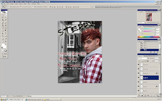
I have now put on all of my cover lines so now it is starting to look more like a magazine cover. i have downloaded fonts and used them but i have edited them so that they fit in with my magazine style. I have also put an outer glow on my title so that it stands out from the background image.

This is my finished magazine front cover. I have finished it off with a headline, bar code and all the price details. Most things on this front cover are very easy to do so i have made it very efficient and easy to make. I am happy with the outcome of my front cover but i still think it looks slightly like a poster rather than a magazine front cover. I have used the drop shadow and outer glow tool the most on my front cover so that the fonts would stand out and look appealing, i feel i achieved a reasonable look by using this tool. I am mostly happy with my main image as it looks very urban like and has a decent background so that the subject matter stands out from any other thing.
No comments:
Post a Comment