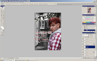
This is the image that i will be using on my front cover as the main image. This photograph has been taken in Coventry City Centre in a back alley so that i could get an urban sort of scene in the background so it looked as effective as i could get it to look as a urban cover. This subject in this image is of Benedict Sycamore who is portraying an upcoming artist who is a producer of
dubstep and ghetto glitch type of music genre. Other images of him will appear on the double page spread along with images of another upcoming artist. I have decided that i am going to make the background of this image black and white so that the subject matter stands out and looks appealing. Most urban magazine front cover main images are not of a natural background or use
natural light they are usually all staged
photo shoots which use spot lights as such. I have decided to change that and use a natural image which will draw most readers into the magazine because it will be something different which still looks as appealing and effective, if not more.
Image 2

This is the image i will using as my contents main image. I have decided to use this image as it has direct eye contact with the viewer which would draw them into reading and viewing this page maybe just because it looks aesthetically appealing or because they wish to view the contents page in general. This will not be the only image i will be using on the contents page, i will be using 4 other images so it does not look boring. I have decided to use this image of Rob as the contents page image so that i have a different contrast of images on each page, if i used another image of Benedict on the contents page i think the viewer would be bored easily. Using another image has changed the atmosphere.
Image 3

This will be one of the inset images i will be using on my contents page at the bottom of the page. I have chosen this image as it shows a partnership with the two people. The faces pulled are very neutral and it looks as if they are a small group of a band. I have decided a staged
photo shoot for this image as it makes the subjects contrast from the white background. The light on their faces is overly lit which takes the eye off the image and more onto what their wearing.
Image 4

I have chosen this as another image that i will be using on my contents page at the bottom. I have chose this image as it has direct eye contact with the viewer which makes them feel as if they are looking at the
person directly. I will be editing this photo slightly so that the background is all white and the blue stands out from the rest of the image. The pose is very neutral and the camera angle is from above empowering the subject matter.
Image 5

This will the last image that i will be using on my contents page. This will be the last of the 3 images you will see at the bottom of the contents page. I have chosen this image because it looks like a very professional image, also the subject stands out from the white background. I will not be editing this image in anyway, i will use the image in its original format. This shot has been taken from directly
in front of the subject matter so it is not over powering.
Image 6

This is the image i will be using for my double page spread and one side has an image of the upcoming artist and the other side is a white brick wall for shit i will be writing up my interview on. This image looks very professional and appealing as the target is standing out and not giving direct eye contact to the reader. It does not look as if it is a staged
photo shoot.


